Google gives site creators more control over design, layout, social links and search than ever before.
Google Sites lets you choose overall site colors and fonts as well as manage many page design and layout options. These options let you create a site with a custom theme that conforms to your organization’s design standards and style.
Site editors and owners have more control over Google Sites features for page layout and functionality, as well. For instance, in Google Sites:
To explore each of these Google Sites features below, sign in with your Google account to a Google Site that you either have created or to which you have editor access.
Jump to:
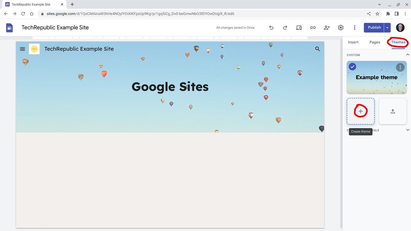
Google Sites gives you the ability to create and edit a custom theme, which provides significant control over colors, fonts, images, navigation and, more recently, spacing (Figure A).
Figure A

With a custom theme you may make the site design conform closely to your organization’s established brand standards. A marketing manager, for example, might make a new Google Site, then select Themes | +Create Theme, then add their organization’s logos, custom colors and fonts and save the site.
When other people in the organization need a site, they can make a copy of the customized starter site via More menu | Make A Copy. They can then add their colleague as an editor of the site from Share With Others | Add their email address | Choose Editor role. Optionally, they can transfer ownership of the site to their colleagues by selecting Share with others | Select the role next to the person | Transfer ownership.
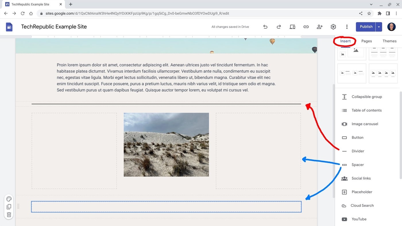
Dividers and spacers allow you to place lines and empty areas between content on a page (Figure B).
Figure B

Horizontal dividers can delineate content that might otherwise be inaccurately paired, and spacers can add blank — or, in design terms, negative — space between content items. Spacers may be resized into a variety of rectangular shapes, and you may move them around your page as desired. Spacers might best be placed around content you wish to feature in an uncluttered portion of a page.
Collapsible text boxes are used when the first line of the text provides the context people need to decide whether to expand the text or not (Figure C).
Figure C

A collapsible text box works well for things such as FAQs, support pages and detailed multi-step processes. To add a collapsible text box to a page, select Insert | Collapsible group. Next, fill in the title text, which is what auto-displays, as well as the more detailed text that will be revealed below after a visitor selects the title.
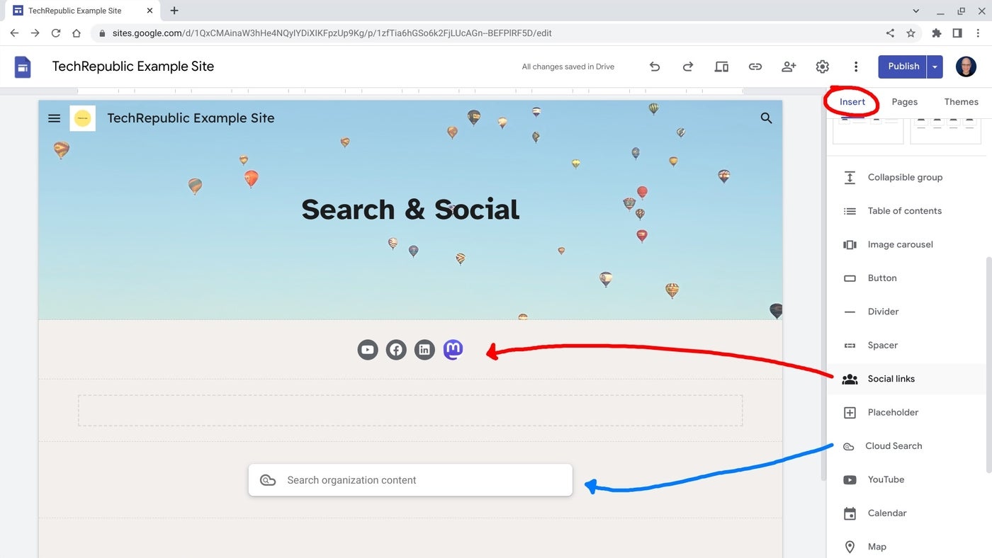
Social links and Cloud Search are each best suited for use on public sites and internal sites, respectively (Figure D).
Figure D

You may use either on any site, but social links may not be terribly useful on an intranet, since people in the organization are quite likely to be familiar with an organization’s social media accounts. Similarly, Cloud Search, which can be configured to search Google Drive, will likely only be of use to people already signed in with an organizational Workspace account, not the general public.
To add social links, select Insert | Social links, then add the web address of your accounts. The system will automatically add icons for popular sites, such as Facebook, Instagram, Pinterest, TikTok, Twitter and YouTube. If you need to link to a newer social network, such as Mastodon, you may upload or provide a link to an appropriate JPG or PNG file.
Site search may be configured in two ways: as a menu option, configured at Settings | Navigation | Search settings, or as an inserted item on a page, viaInsert | Cloud Search.
You may configure the menu search option to search “This site” or “Organization content,” or you can hide it entirely. The inserted Cloud Search box, however, solely supports search of your organization’s content for people signed in to organizational Workspace accounts. To learn more about Google Cloud Search, see How to get Google search capabilities for your corporate data with Google Cloud Search.